AI Graffiti Readability Test 2026: Bubble Letters vs Stencil vs Throw-Up vs Wildstyle
 By Marvin/June 11, 2026 at 5:11 PM/1 min read
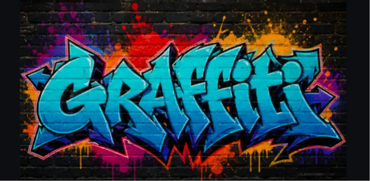
We tested how AI handles the same short graffiti word across four lettering styles: bubble letters, stencil graffiti, throw-up graffiti, and wildstyle. This article is not a general AI graffiti generator tutorial. It focuses on one practical question: which graffiti style keeps a word readable after the AI adds outlines, drips, arrows, wall texture, and spray-paint effects?
The test is useful for creators who need graffiti text for names, usernames, posters, stickers, streetwear mockups, and album-cover concepts. If you want to repeat the test, use Vidoly AI Graffiti Art Generator with the same word and change only the style, so the result is easier to compare.
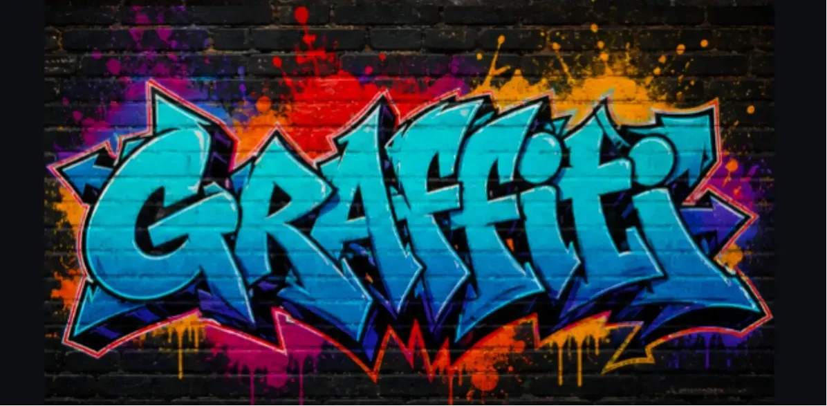
ty-benchmark-four-styles.png" alt="AI graffiti readability benchmark comparing bubble letters, stencil graffiti, throw-up graffiti, and wildstyle on urban walls">
Graffiti style choice has a direct impact on whether AI-generated text stays readable.
Readability Scorecard: Which Style Wins?
Bubble letters scored highest for everyday readability because the letters stay large and separated. Stencil graffiti came second because the shapes are sharp and high contrast. Throw-up graffiti kept more street energy but started to compress letter spacing. Wildstyle created the strongest mural look, but it was the least reliable for exact spelling.
Style | Readability | Visual Impact | Best Use Case |
|---|---|---|---|
Bubble Letters | 9/10 | Bold and friendly | Names, stickers, posters, profile graphics |
Stencil Graffiti | 8/10 | Sharp and graphic | Posters, slogans, event art, bold titles |
Throw-Up Graffiti | 7/10 | Fast and street-authentic | Tags, streetwear mockups, music artwork |
Wildstyle | 4/10 | High-energy and complex | Mural concepts, background art, gaming banners |
Test Result 1: Bubble Letters Keep the Word Structure Clear
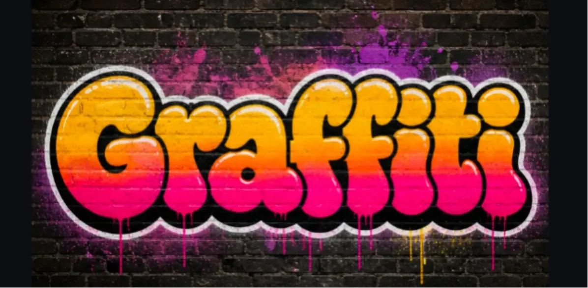
Bubble letters work well because the AI can build large rounded letterforms with thick outlines, visible fills, shadows, and paint drips. The style gives each letter enough room to stay separate, which makes it useful for short names, usernames, sticker ideas, and social profile graphics.
The tradeoff is tone. Bubble graffiti can look playful or cartoon-like if the prompt does not include stronger details such as rough spray edges, brick texture, black outlines, chrome highlights, or weathered wall paint.
Best for: readable names, simple brand concepts, stickers, social media headers, youth-oriented posters.
Avoid when: you need an aggressive underground mural look or very complex interlocking letter structure.
Test Result 2: Stencil Graffiti Preserves Hard Edges and Contrast
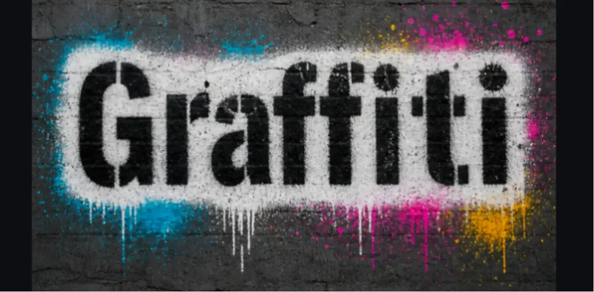
Stencil graffiti keeps text clearer because the letter shapes are usually flatter, harder-edged, and less tangled than wildstyle. It works especially well for short slogans, event posters, protest-poster aesthetics, album promo graphics, and high-contrast wall art.
The limitation is that stencil graffiti may feel less hand-painted. If you want a more organic street-art look, add rough overspray, chipped paint, uneven wall texture, or layered spray marks around the letter edges.
Best for: posters, event titles, bold words, black-and-white graphics, readable wall concepts.
Avoid when: you want flowing handstyle, bubble volume, or complex graffiti lettering.
Stencil, throw-up, and wildstyle each solve a different design problem.
Test Result 3: Throw-Up Graffiti Is the Best Middle Ground
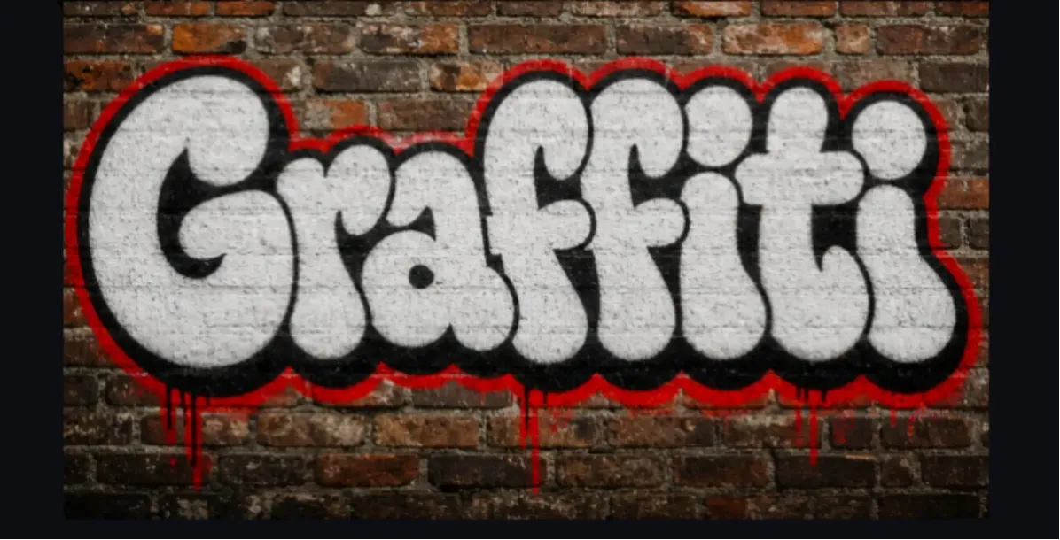
Throw-up graffiti is often the best compromise for AI-generated text. It usually uses bold rounded letters, simple two-color fills, strong outlines, and fast wall-paint energy. That makes it more street-authentic than stencil while still being easier to read than wildstyle.
This style works best with one short word. Long phrases can become compressed because throw-up letters are large and need breathing room. If you use a phrase, keep it to two words and avoid too many symbols or punctuation marks.
Best for: streetwear concepts, rap cover art, skate graphics, bold usernames, quick tag-style visuals.
Avoid when: the design needs small typography, long copy, or clean corporate readability.
Test Result 4: Wildstyle Looks Strong but Breaks Letter Accuracy
Wildstyle is the most visually intense option because it uses interlocking letters, arrows, extensions, sharp movement, and layered shapes. It can make an AI graffiti image feel like a serious mural, but the same complexity also makes spelling less reliable.
Use wildstyle when the vibe matters more than exact text. It is a strong choice for background murals, gaming banners, cyberpunk-style visuals, album mood boards, and energetic urban scenes. For logos, names, or merchandise text, generate a readable bubble or stencil version first, then use wildstyle as a visual alternative.
Best for: high-energy murals, abstract street art, backgrounds, gaming art, music visuals.
Avoid when: every letter must be correct and readable at first glance.
Short Word vs Long Phrase: Where AI Graffiti Starts to Fail
AI graffiti works best with one word or a very short phrase. A short word gives the model enough space for outlines, 3D shadows, highlights, drips, and readable letter spacing. A long phrase forces the model to compress many letter-like shapes into the same wall area, which increases the chance of distorted spelling.
For names, tags, usernames, and poster titles, use one to two words. For longer text, create the graffiti word as the main artwork and add the supporting copy later in a design tool where typography can be controlled precisely.
Style Choice Matrix by Design Goal
Use Case | Recommended Style | Why It Works |
|---|---|---|
Sticker or avatar | Bubble letters | Large shapes stay clear at small sizes |
Event poster | Stencil or bubble letters | Readable from a distance |
Streetwear mockup | Throw-up graffiti | Bold, fast, and still fairly readable |
Album cover | Throw-up or wildstyle | Balances attitude, motion, and visual density |
Background mural | Wildstyle | Complexity adds energy even when letters are abstract |
Logo concept | Bubble or stencil first | Spelling and silhouette are easier to review |
For commercial work, treat AI graffiti as a concept draft and review spelling, rights, and production quality.
Commercial Use Checklist Before Publishing AI Graffiti
AI graffiti can be useful for T-shirt mockups, album covers, posters, gaming banners, stickers, and mural concepts, but it should be reviewed before paid use. Graffiti text is especially risky because a design can look visually strong while still containing a misspelled or distorted word.
Check every letter: zoom in and confirm the word is actually spelled correctly.
Check readability at final size: test whether the design still works on a phone screen, shirt, poster, or thumbnail.
Check rights: avoid brand logos, copyrighted characters, protected graffiti references, or artist-specific imitation.
Check resolution: make sure the output is large enough for the intended print or digital use.
Clean up if needed: use a designer or vector tool for final logos, merchandise, and client-facing files.
Final Recommendation from the Test
Choose bubble letters if your main goal is readable graffiti text. Choose stencil if you need bold poster-style words. Choose throw-up graffiti when you want a stronger street feel without losing too much readability. Choose wildstyle when the image needs impact, movement, and mural energy more than exact spelling.
A practical workflow is to generate the same word in two passes: first with bubble or stencil to confirm the spelling and basic shape, then with throw-up or wildstyle to explore a more expressive visual direction. You can test that workflow with Vidoly AI Graffiti Art Generator.
FAQ
Which AI graffiti style is easiest to read?
Bubble letters are usually the easiest to read because the letters are large, rounded, and clearly separated. Stencil graffiti is also highly readable when the prompt asks for bold, high-contrast letter shapes.
Is wildstyle bad for AI graffiti text?
Wildstyle is not bad, but it is less reliable for exact spelling. It is better for visual impact, movement, and mural complexity than for names or logos that must be readable immediately.
What graffiti style should I use for a logo concept?
Start with bubble letters or stencil graffiti because the word shape is easier to review. After you confirm the spelling and silhouette, you can create a wilder version for mood or style exploration.
Why does AI graffiti text become distorted?
AI image models often treat letters as visual shapes rather than editable typography. Long phrases, complex wildstyle, dense arrows, and crowded wall compositions make it harder for the model to preserve exact spelling.
Should I use one word or a full phrase?
One short word is usually best. A two-word phrase can work if both words are short, but long phrases often become compressed or distorted in graffiti-style image generation.
Which style is best for streetwear graphics?
Throw-up graffiti is a strong choice for streetwear because it feels bold and street-authentic while staying more readable than wildstyle. Bubble letters also work well for playful or youth-focused apparel.
Which style is best for posters?
Stencil graffiti and bubble letters are the safest choices for posters because they can stay readable from a distance. Wildstyle can work as a background element, but it is risky for the main title.
Can I use AI graffiti for commercial designs?
You can use AI graffiti as a concept or draft, but check the tool license, text accuracy, image resolution, and potential brand or copyright conflicts before using it on paid products, ads, or client work.