How to Tell AI Models Font and Background Colors in Natural Language
 By Marvin/May 11, 2026 at 9:59 AM/1 min read
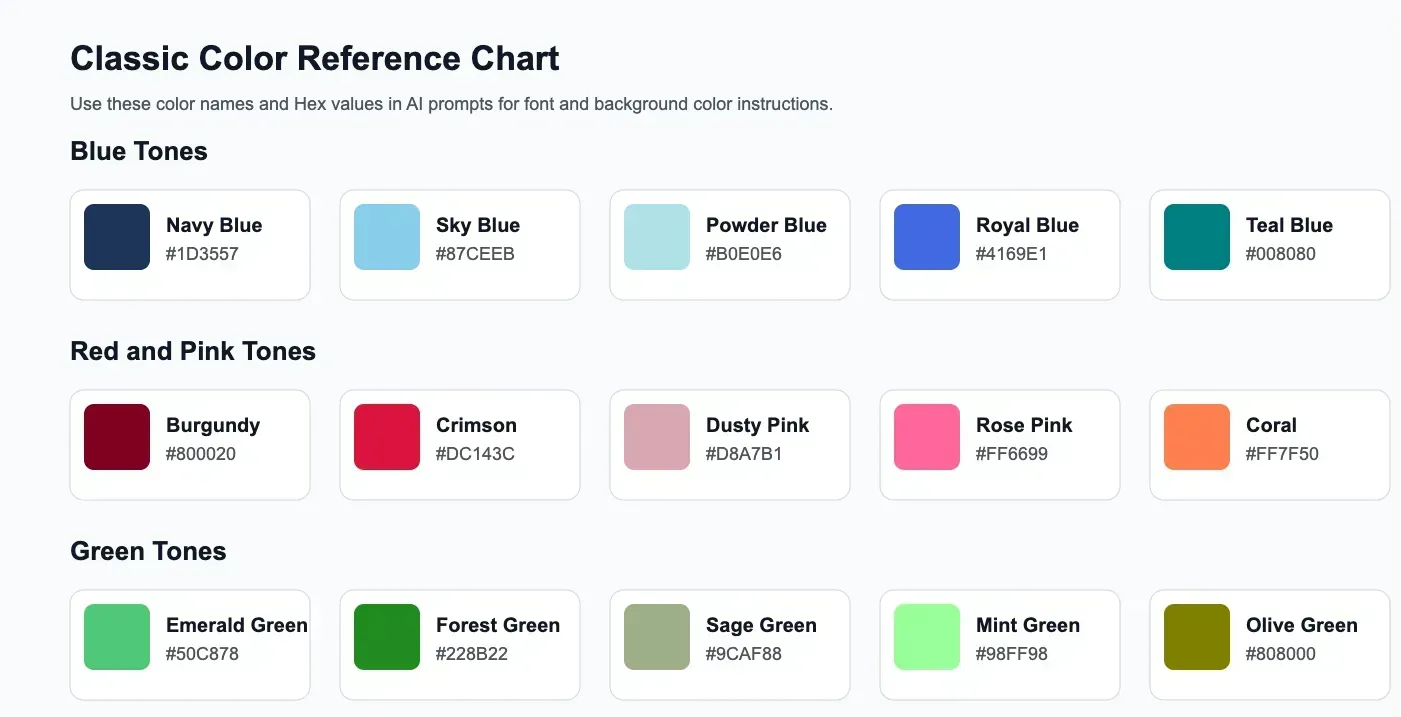
This guide explains how to tell an AI model what colors you want, how to make prompts clearer, and which classic color prompts work well for design, branding, and content creation. To make the ideas easier to understand, each section includes a matching background color block.
Why Color Prompts Matter in AI Image and Design Generation
When users write prompts for AI image generation or AI design tools, they often focus on the subject, style, or composition. But color instructions are just as important. A vague prompt like make it modern may produce inconsistent results, while a more specific prompt like use white text on a deep navy blue background gives the model a much stronger visual direction.
Clear color prompts help with:
- Better text readability
- Stronger brand consistency
- More professional visual output
- Faster prompt iteration
- More accurate control over mood and contrast
How to Describe Font Color and Background Color to an AI Model
The best way is to describe the two parts separately and directly: the font color and the background color.
A useful structure is:
You can also add extra detail such as tone, contrast, finish, and style:
Best Practices for Writing Color Prompts
Be Specific Instead of Generic
Instead of writing use blue, write use deep navy blue. Instead of writing use red background, write use a rich burgundy red background. Specific wording helps the model choose a closer visual match.
Mention Contrast
If readability matters, say so directly: Use high-contrast white text on a dark charcoal background.
Describe the Mood
Colors carry emotion. You can guide the model better by describing the feeling, such as warm and inviting, elegant and luxurious, fresh and natural, bold and energetic, or calm and minimal.
Say If You Want a Flat or Solid Color Background
If you do not want gradients or 3D effects, make that explicit: Use a flat solid beige background with dark brown text.
Classic Color Prompt Examples for Font and Background
White Text on Dark Navy Blue Background
This is one of the most classic combinations for technology, finance, SaaS, and corporate branding. It feels clean, modern, and trustworthy.
White font on dark navy blue background
Black Text on Warm Beige Background
This combination is excellent for lifestyle brands, editorial layouts, beauty, handmade products, and minimalist websites. It feels soft, premium, and natural.
Black font on warm beige background
White Text on Emerald Green Background
Emerald green adds freshness and sophistication. It works well for wellness, organic brands, nature themes, and premium packaging.
White font on emerald green background
Cream Text on Chocolate Brown Background
This is a great choice for bakery brands, coffee shops, dessert packaging, and cozy seasonal promotions. It feels warm and inviting.
Cream font on chocolate brown background
White Text on Burgundy Red Background
Burgundy creates a rich and luxurious effect. This combination is useful for wine brands, upscale beauty products, festive visuals, and premium promotions.
White font on burgundy red background
Dark Gray Text on Light Gray Background
This combination works well for minimal branding, editorial design, portfolio layouts, and modern UI concepts. It feels understated and balanced.
Dark gray font on light gray background
White Text on Black Background
This is a timeless high-contrast combination for bold branding, luxury fashion, modern posters, and dramatic layouts.
White font on black background
Soft Pink Text on Off-White Background
This palette fits beauty brands, feminine packaging, wedding materials, and elegant social media graphics.
Dusty pink font on off-white background
Light Blue Text on Deep Charcoal Background
This combination is great for futuristic design, digital products, gaming visuals, and modern AI-related branding.
Light blue font on charcoal background
Gold Text on Dark Green Background
This palette feels classic, elegant, and upscale. It works well for premium invitations, heritage brands, and luxury packaging.
Gold font on dark green background
How to Make Your AI Color Prompts More Accurate
If you want more predictable results, combine color instructions with style instructions. For example:
Or:
This works better than only naming colors because it gives the model more design context.
Useful Color Words You Can Use in Prompts
Blue Tones
| Color Name | Hex | Preview |
|---|---|---|
| Navy Blue | #1D3557 | |
| Sky Blue | #87CEEB | |
| Powder Blue | #B0E0E6 | |
| Royal Blue | #4169E1 | |
| Teal Blue | #008080 |
Red Tones
| Color Name | Hex | Preview |
|---|---|---|
| Burgundy | #800020 | |
| Crimson | #DC143C | |
| Coral | #FF7F50 |
Yellow Tones
| Color Name | Hex | Preview |
|---|---|---|
| Mustard Yellow | #D4A017 | |
| Golden Yellow | #FFCC00 | |
| Lemon Yellow | #FFF44F | |
| Amber | #FFBF00 | |
| Butter Yellow | #FCE883 |
Orange Tones
| Color Name | Hex | Preview |
|---|---|---|
| Burnt Orange | #CC5500 | |
| Tangerine | #F28500 | |
| Peach Orange | #FFB07C | |
| Apricot | #FBCEB1 | |
| Terracotta Orange | #C96A3D |
Pink Tones
| Color Name | Hex | Preview |
|---|---|---|
| Dusty Pink | #D8A7B1 | |
| Rose Pink | #FF6699 | |
| Blush Pink | #F4C2C2 | |
| Hot Pink | #FF69B4 | |
| Mauve Pink | #E0B0FF |
Green Tones
| Color Name | Hex | Preview |
|---|---|---|
| Emerald Green | #50C878 | |
| Forest Green | #228B22 | |
| Sage Green | #9CAF88 | |
| Mint Green | #98FF98 | |
| Olive Green | #808000 |
Neutral Tones
| Color Name | Hex | Preview |
|---|---|---|
| Beige | #F5F5DC | |
| Cream | #FFFDD0 | |
| Ivory | #FFFFF0 | |
| Charcoal Gray | #36454F | |
| Warm White | #FDF6E3 |
Brown and Warm Tones
| Color Name | Hex | Preview |
|---|---|---|
| Chocolate Brown | #7B3F00 | |
| Caramel | #C68E52 | |
| Mocha | #967969 | |
| Terracotta | #E2725B | |
| Sand | #C2B280 |
Sample Natural Language Prompt Templates
Simple Template
More Detailed Template
Advanced Template
Common Mistakes to Avoid in AI Color Prompts
Using Vague Color Words
Words like nice blue or pretty red are too subjective.
Forgetting the Background
If you only describe the font color, the model may choose a conflicting background.
Ignoring Contrast
Some color combinations look attractive in theory but reduce readability.
Mixing Too Many Colors
Too many color directions in one prompt can confuse the model and weaken the design.
Text to Image Prompt Tips: Practical Rules That Improve Results
If you are writing text to image prompts for AI image tools, color is only one part of the instruction. Strong AI image prompts usually combine subject, style, composition, lighting, and color in a clear order. The goal is not to make prompts longer for no reason, but to make them more specific, more controllable, and easier for the model to interpret.
A practical prompt structure looks like this:
Start With the Main Subject First
The model should immediately understand what the image is about. Instead of writing make a nice product image, write a glass skincare bottle centered on a stone pedestal. A concrete subject improves consistency far more than vague adjectives.
Define Style and Use Case Clearly
Good prompt writing should tell the model what kind of output you want. Is it a product ad, a cinematic portrait, a logo concept, a flat illustration, or a social media hero image? This is especially useful for SEO-friendly AI image prompt tutorials because many readers search for prompts by output type, not by abstract art terms.
- Use format terms like product photo, poster, editorial illustration, social media banner, logo concept, or landing page hero image.
- Use style terms like minimalist, cinematic, realistic, flat design, 3D render, watercolor, retro, luxury, or futuristic.
- Use audience or brand clues when relevant, such as premium skincare, SaaS, gaming, restaurant branding, or wedding stationery.
Control Composition, Angle, and Framing
Many weak prompts fail because they describe the object but not the visual framing. If composition matters, say it directly. For example, use phrases such as center composition, close-up shot, top-down view, wide cinematic framing, or clean negative space on the right for headline text.
Describe Lighting Before Adding Decorative Details
Lighting changes the emotional quality of an image more than small decorative elements. Before adding lots of props, decide whether you want soft daylight, dramatic studio lighting, warm sunset light, neon glow, or moody shadow contrast. This is one of the most reliable ways to improve text to image prompt quality.
Keep Color Instructions Specific and Limited
Most prompt problems happen when users mix too many color directions together. Pick one primary color direction, one support color if necessary, and make the relationship explicit. For example: warm beige background with dark brown typography and subtle gold accents. This gives the model a cleaner hierarchy.
Use Negative Instructions to Remove Common Problems
When an AI image tool supports negative prompting, use it to remove recurring issues such as clutter, extra objects, distorted hands, blurry text, overexposed highlights, heavy shadows, or busy backgrounds. A short negative instruction is often more effective than adding five extra positive descriptors.
Do Not Stack Too Many Style Keywords
A common mistake in AI prompt engineering for images is combining conflicting styles such as minimalist, luxury, cartoon, gritty, dreamy, hyper-realistic in the same instruction. This weakens the image direction. Two or three aligned style cues usually work better than a long list.
Write for Iteration, Not Perfection
The best way to improve prompts is to change one variable at a time. Keep the subject fixed, then test composition, then test lighting, then test color. This makes it much easier to understand why one version performs better. For teams creating blogs, ads, thumbnails, or branded assets at scale, iterative prompting is more useful than trying to write the perfect one-shot prompt.
A Strong Text to Image Prompt Example
Here is a practical example that combines subject, style, composition, lighting, and color direction in a way that is clear and production-friendly:
Quick Checklist for Better AI Image Prompts
- Name the subject clearly.
- Specify the output type or use case.
- Add composition or camera guidance.
- Choose lighting intentionally.
- Limit color directions to a clear hierarchy.
- Remove unwanted elements with negative instructions when supported.
- Test one change at a time instead of rewriting everything.
More To Know
If you want better AI-generated visuals, learning how to describe font color and background color in natural language is a practical skill. Clear color prompts improve consistency, help large models understand your visual intention, and produce results that feel more professional and brand-ready.
The easiest approach is to start with classic combinations like white on navy, black on beige, or cream on brown, then refine the mood and style as needed. With the right wording, even simple prompts can lead to much stronger visual output.
If you want to put these prompt ideas into practice, you can also try Vidoly AI tools built for visual creation. The AI Logo Generator is useful for testing color combinations in branding, icons, and typography-based logo concepts, while the AI Image Generator can help you experiment with background colors, text styling directions, and full visual compositions from natural language prompts.