Why Do AI Graffiti Sometimes Have Spelling Errors?
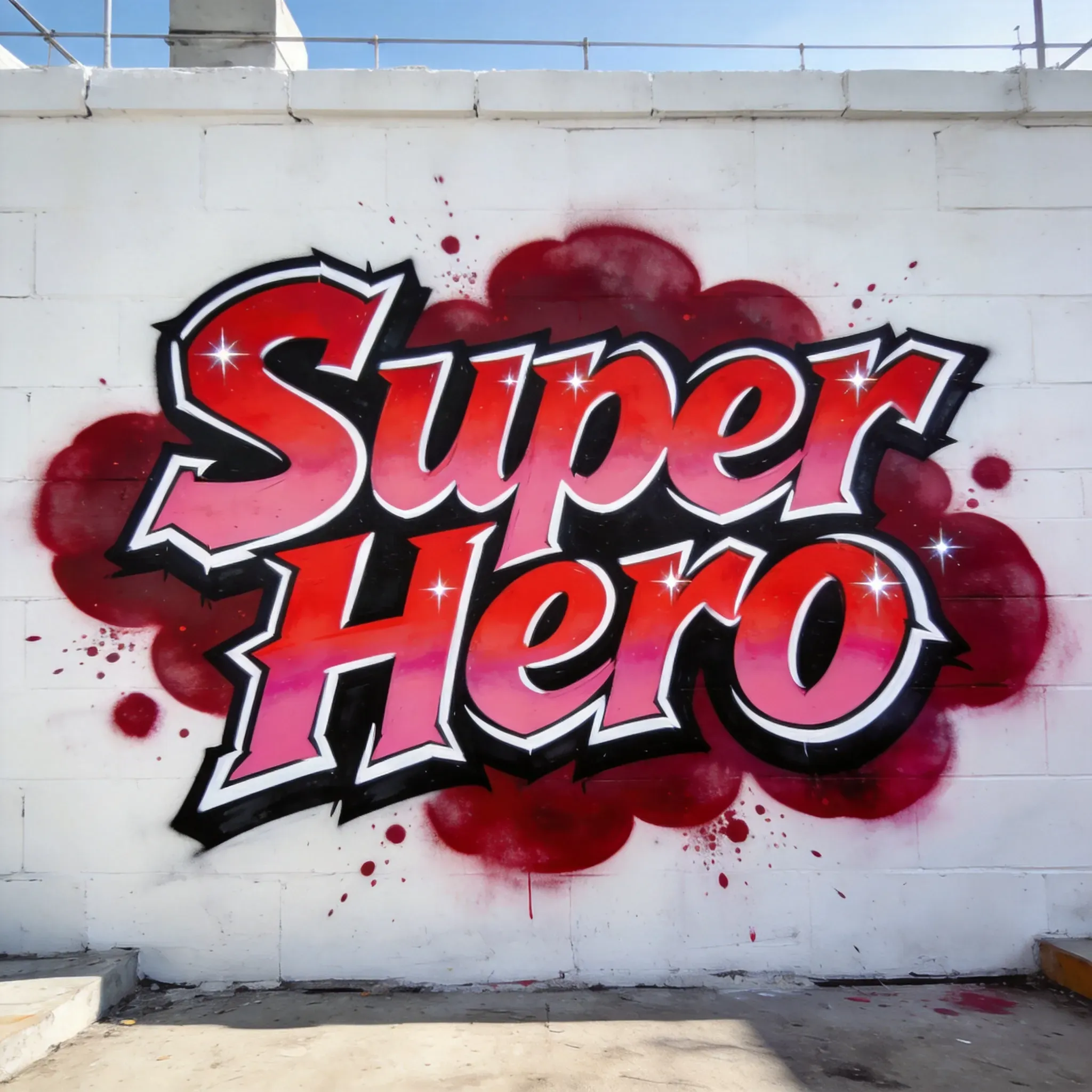
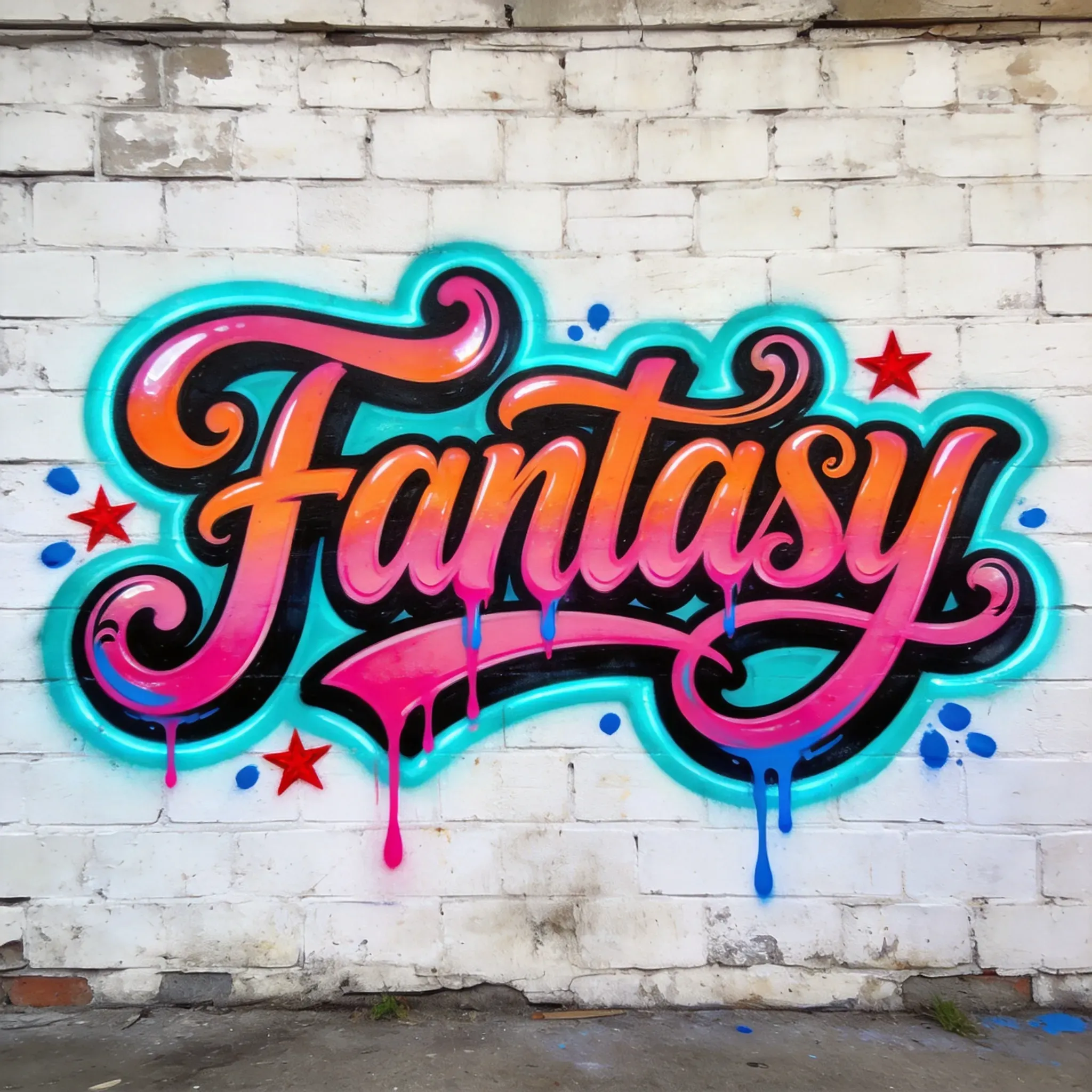
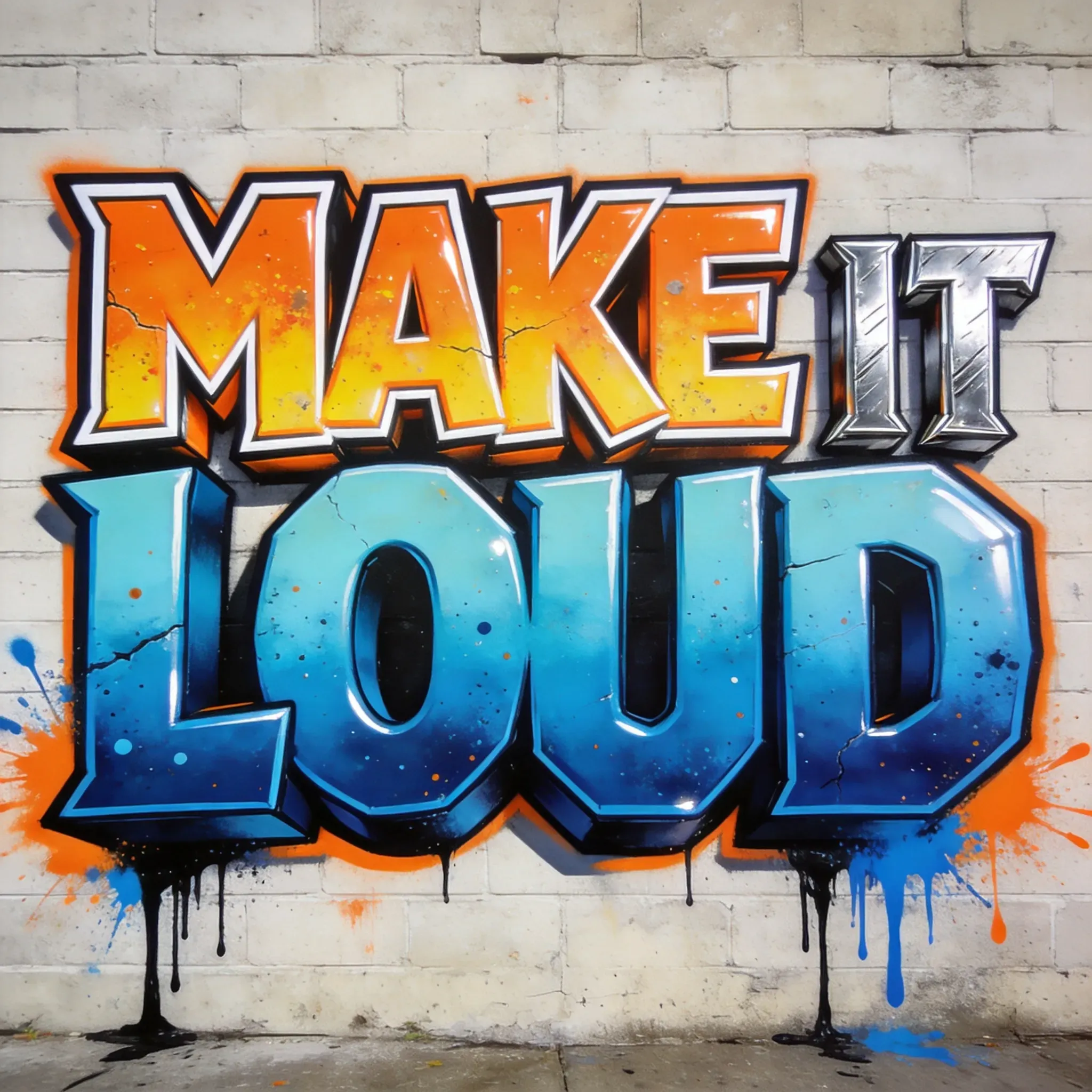
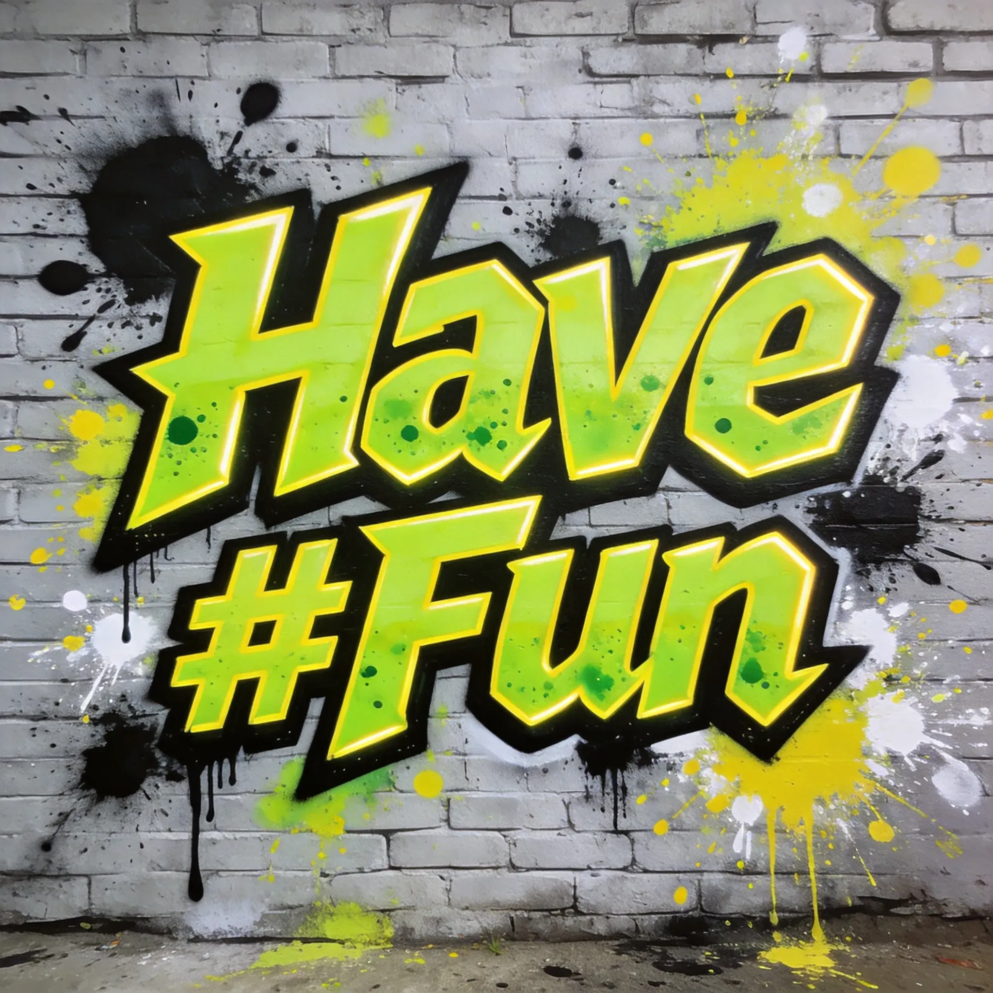
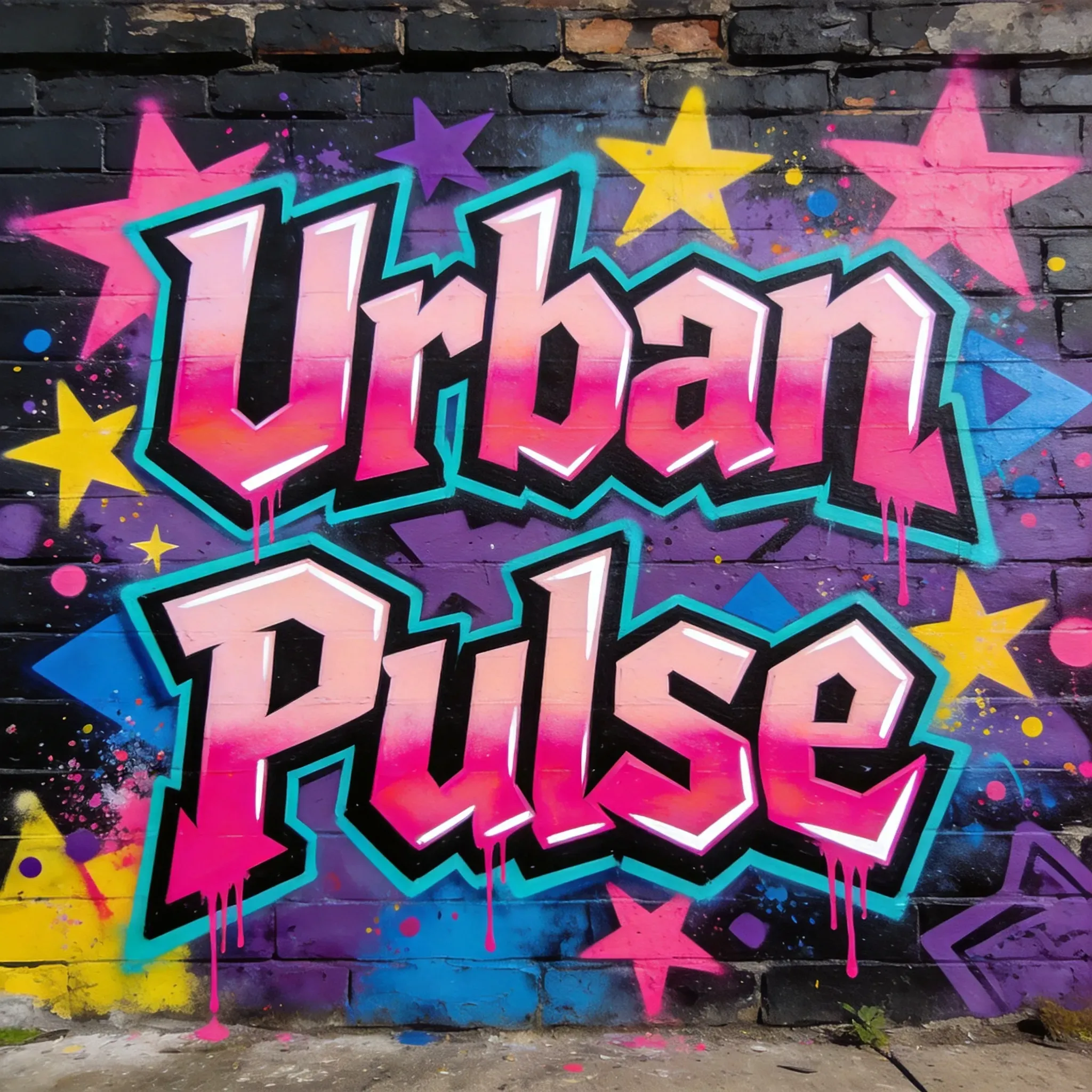
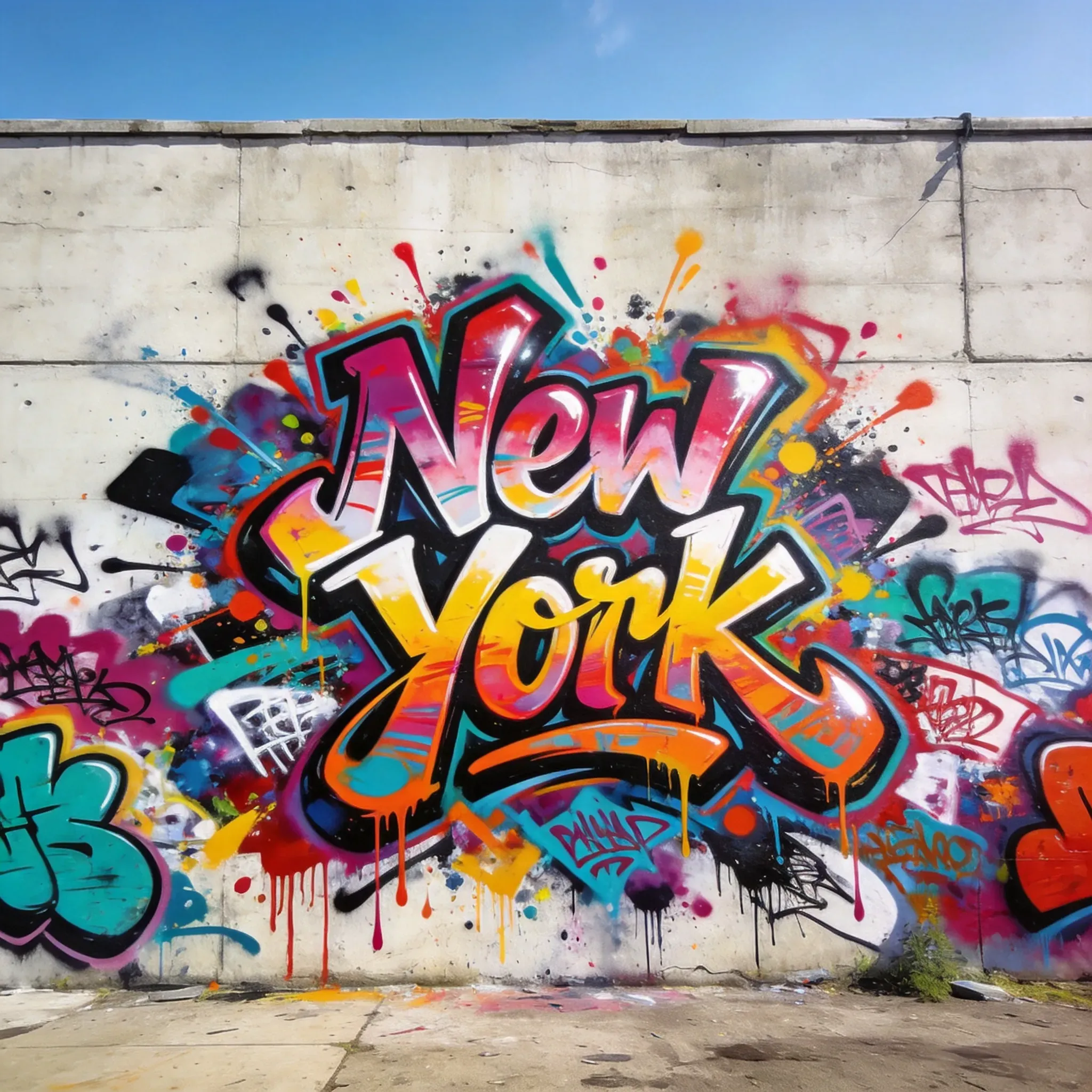
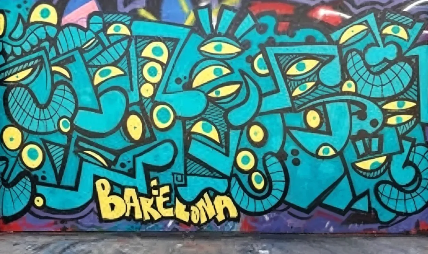
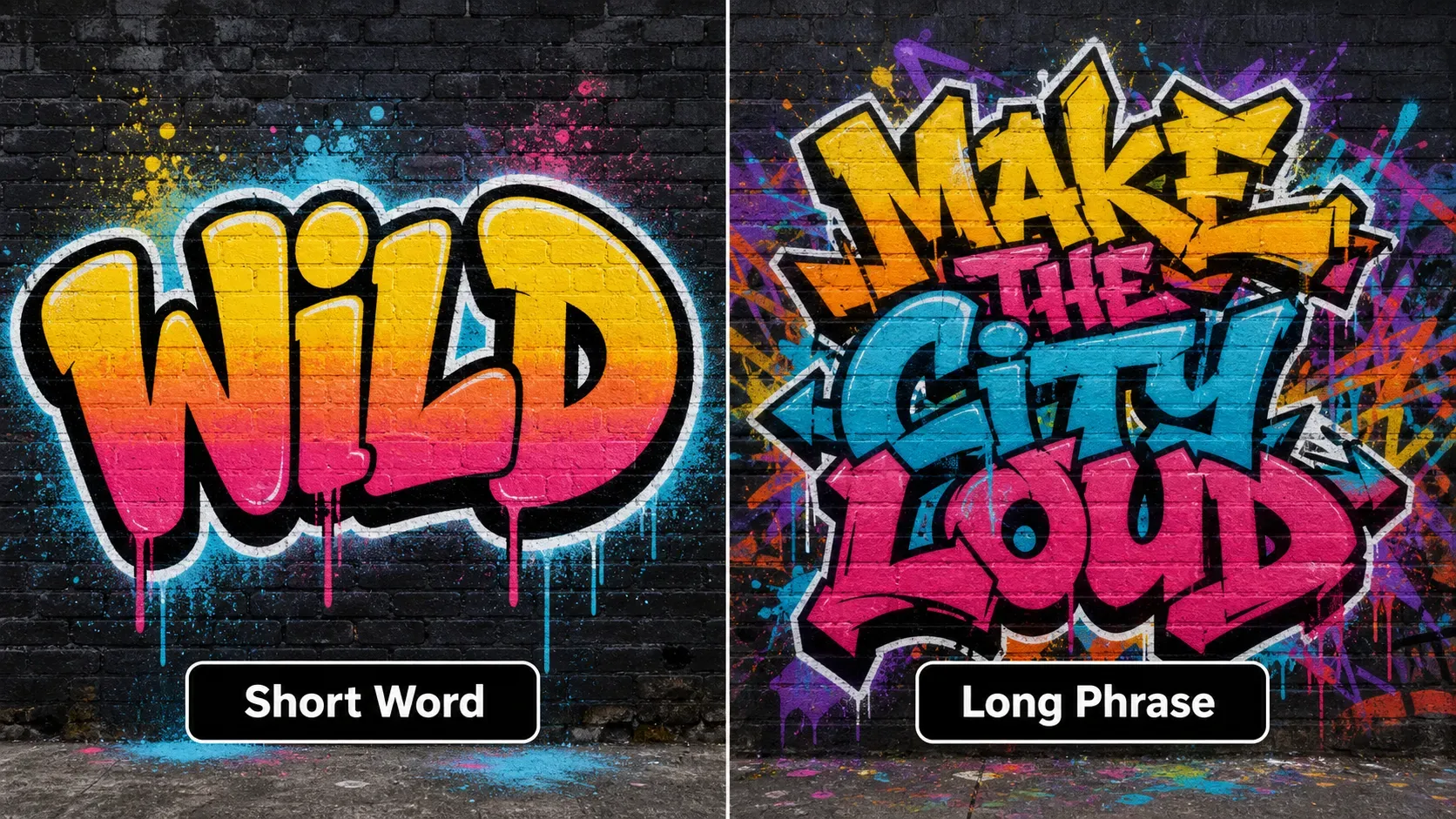
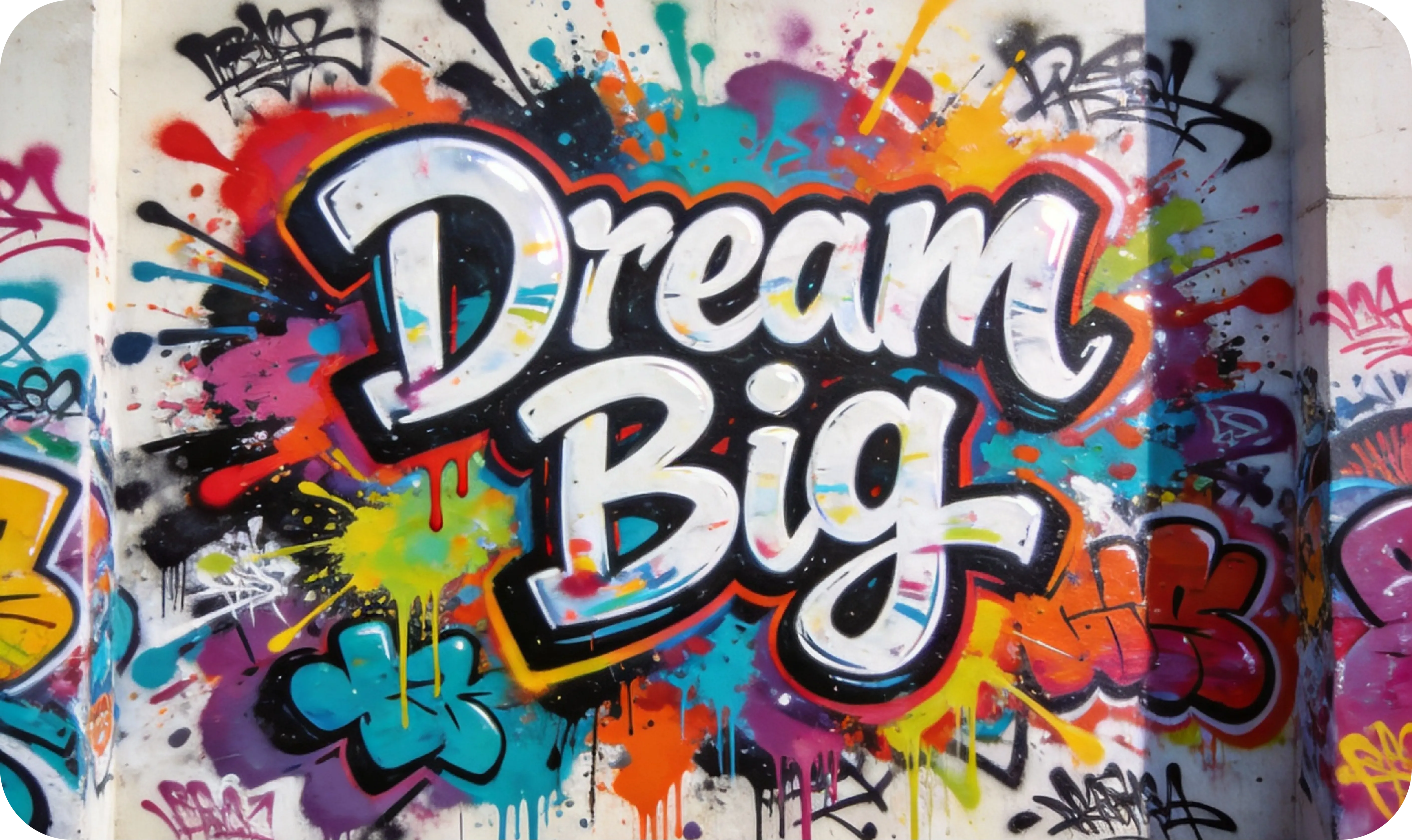
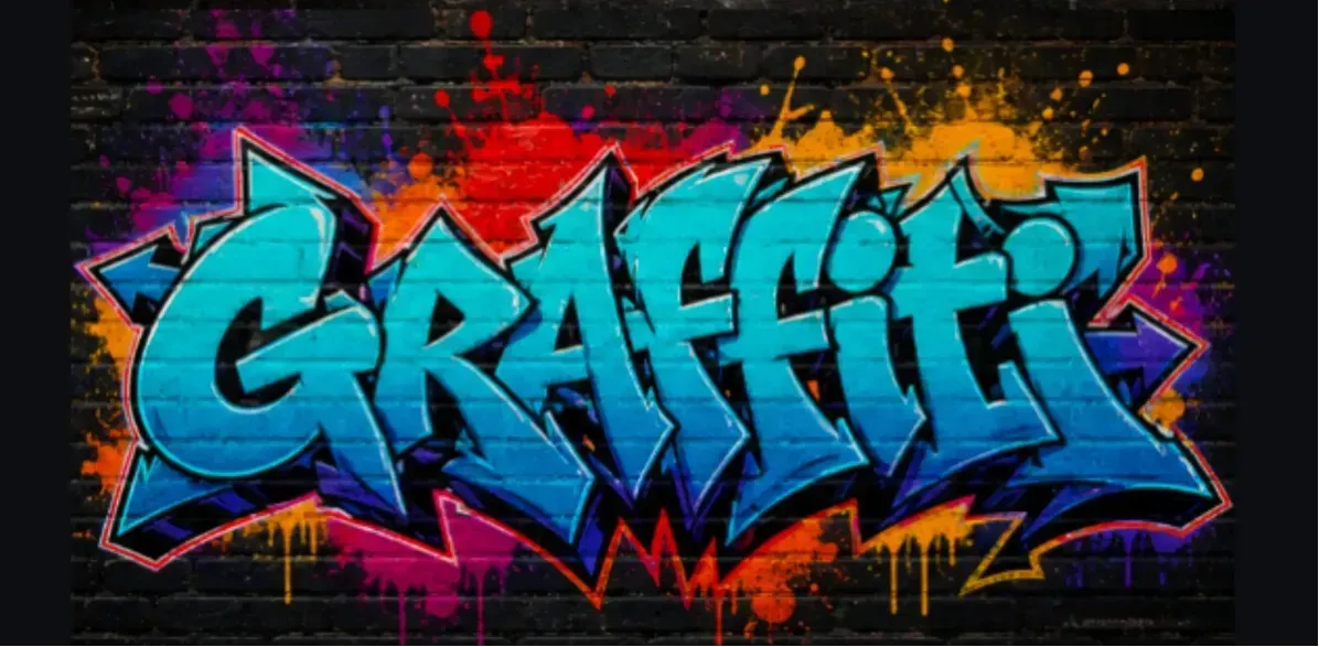
AI graffiti models generate fonts as visual shapes, not editable text. This means the image may look like real spray-painted letters, but character distortion, merged letters, or spelling errors can still occur, especially when handling long phrases, rare names, numbers, symbols, or complex Wildstyle prompts.
How to Make Graffiti Text More Legible?
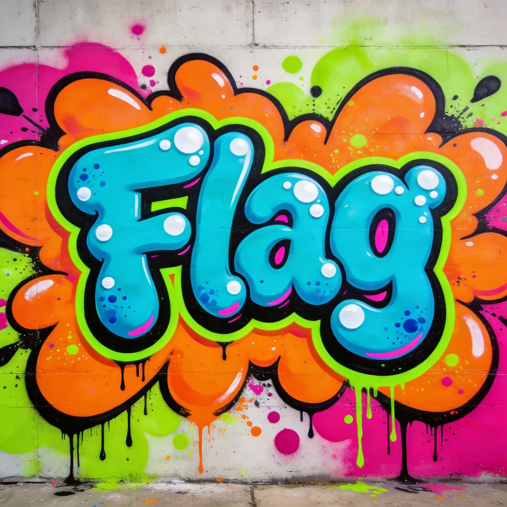
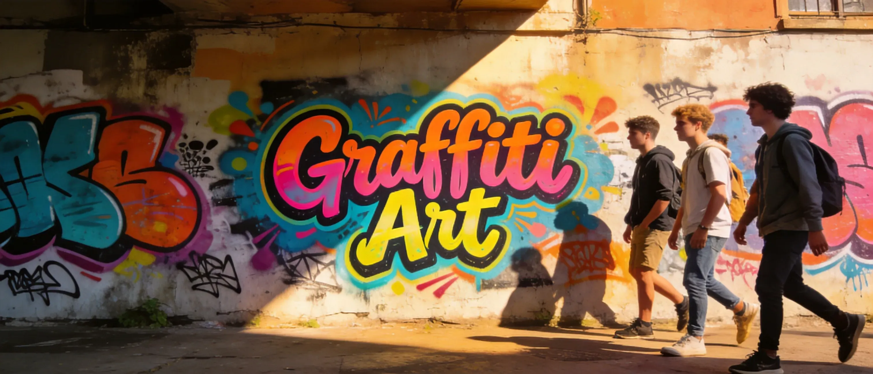
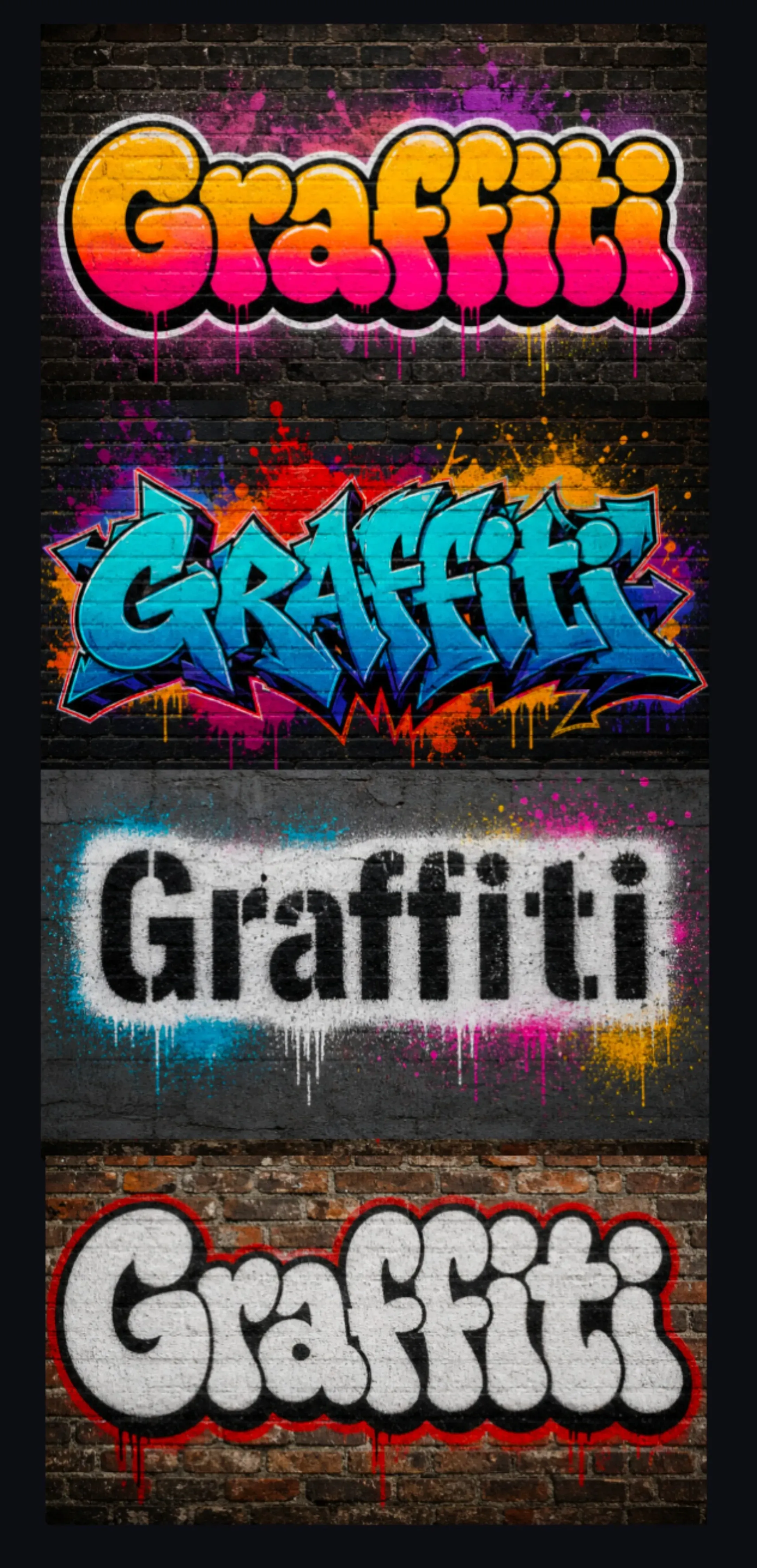
Use one short word, simple spelling, and a clear style such as bubble letters, block letters, throw-up graffiti, or stencil art. Avoid long sentences if exact spelling matters, and use wildstyle mainly when visual energy is more important than readability.
What Are the Differences Between Tag, Throw-Up, Piece, Burner, and Wildstyle?
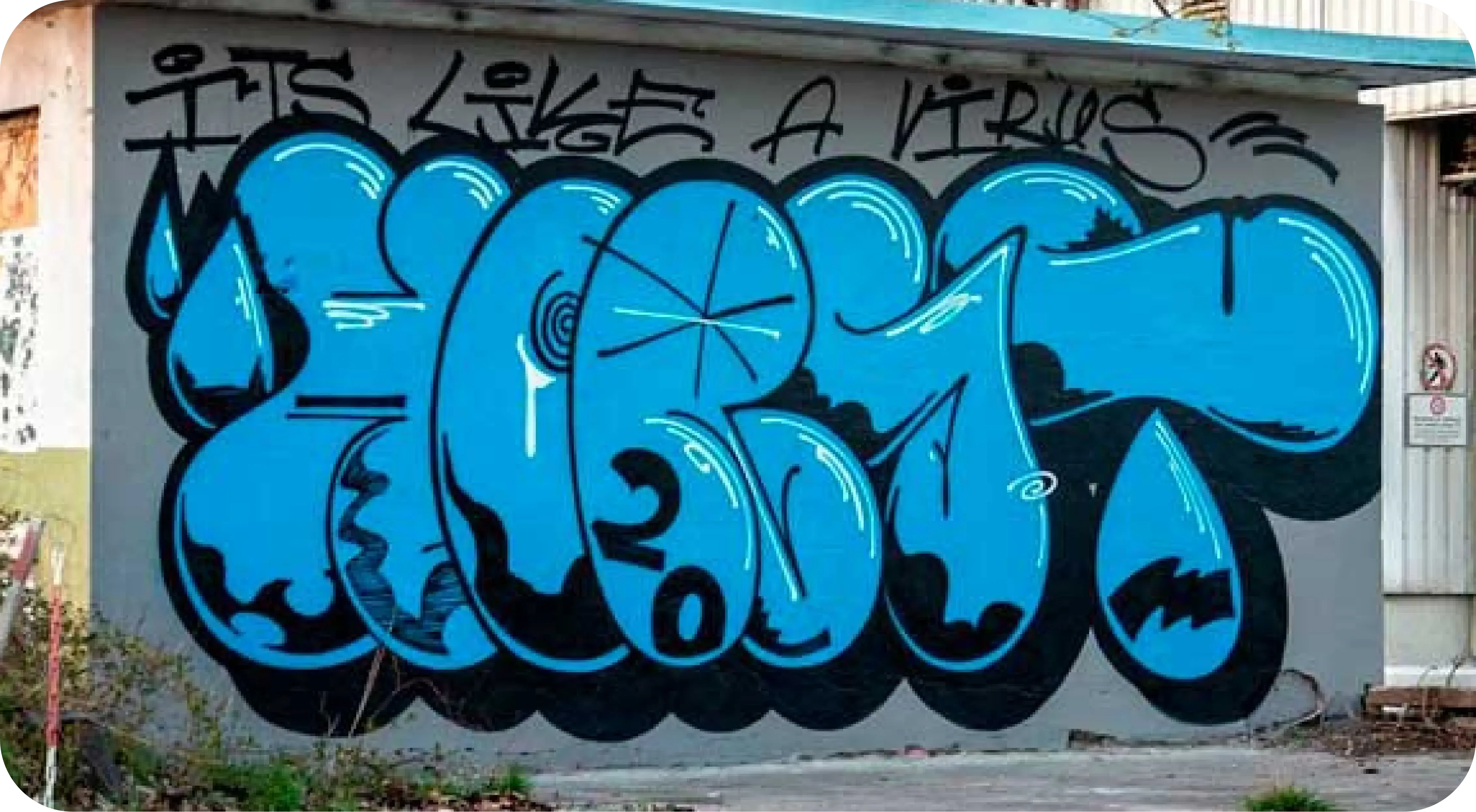
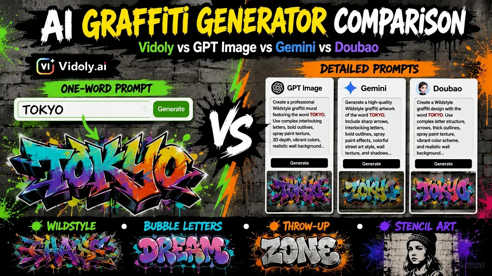
A Tag is a quick artistic signature. A Throw-Up is usually larger and faster, made of simple bubble letters or block letters. A Piece is a more mature graffiti work with color and detail. A Burner is a highly refined, standout Piece. Wildstyle uses complex interlocking letters and arrows, with a dynamic visual effect but may be hard to recognize.
Can I Use AI Graffiti Art for Commercial Purposes?
You can use AI graffiti for posters, clothing, album covers, brand mockups, or social media marketing campaigns, but first check the platform’s licensing terms. Before using designs for paid products or advertisements, also check spelling, trademark conflicts, copyrighted references, and print quality.
Can I Create Graffiti Logos with AI?
Yes, AI can help generate graffiti logo concepts, especially for music projects, streetwear brands, game teams, and creator channels. However, the final logo usually requires manual refinement, as AI images are not editable vector files and may not retain precise font shapes, spacing, or brand consistency.
Can I Upload Reference Images to Define a Graffiti Style?
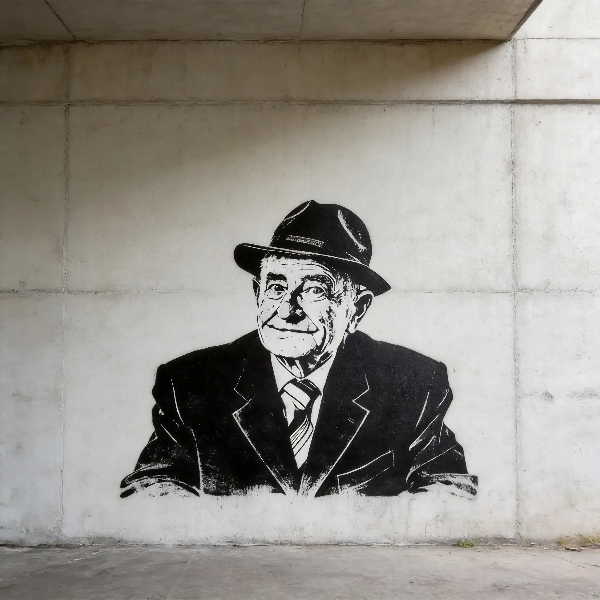
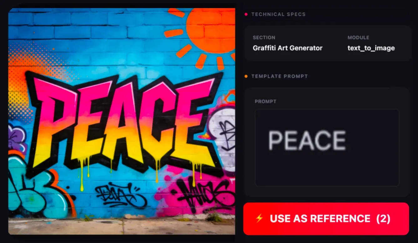
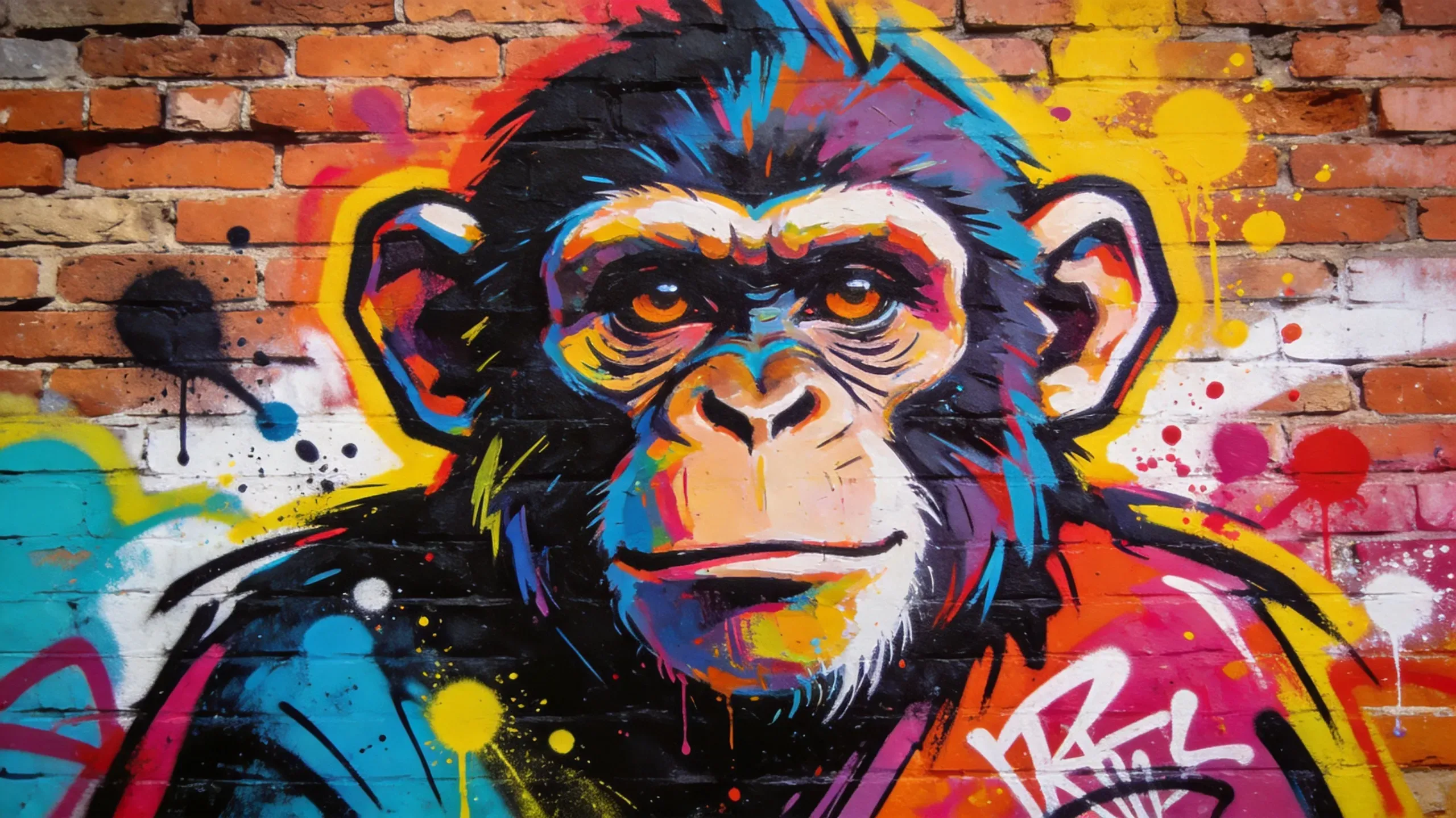
If the tool supports image input, reference images can help guide the style, surface, color atmosphere, or composition. Avoid directly copying copyrighted works or other artists’ unique styles; refer to broad directions like brick wall textures, template effects, neon palettes, or mural layouts.
Which Graffiti Style Is Best for Clear Text?
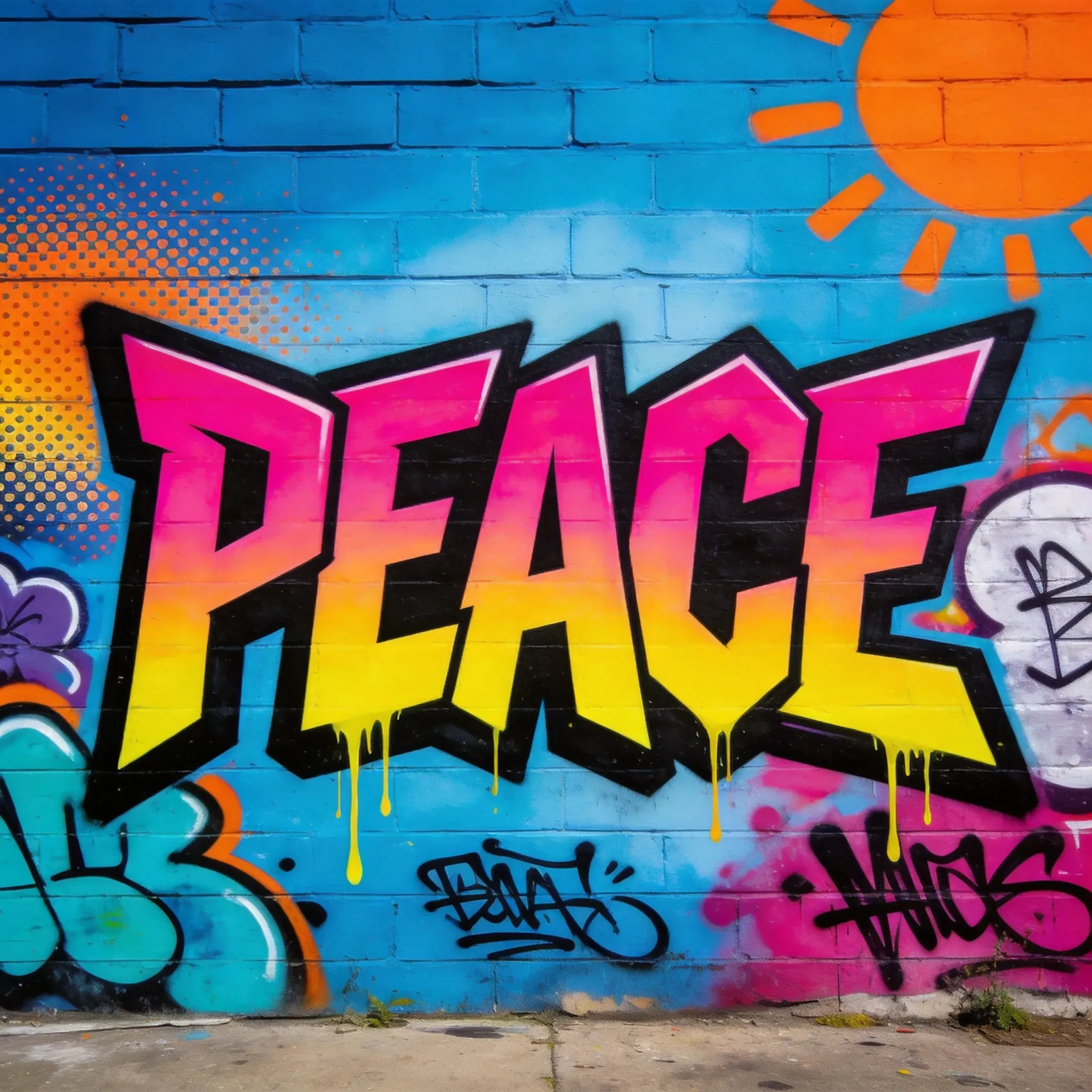
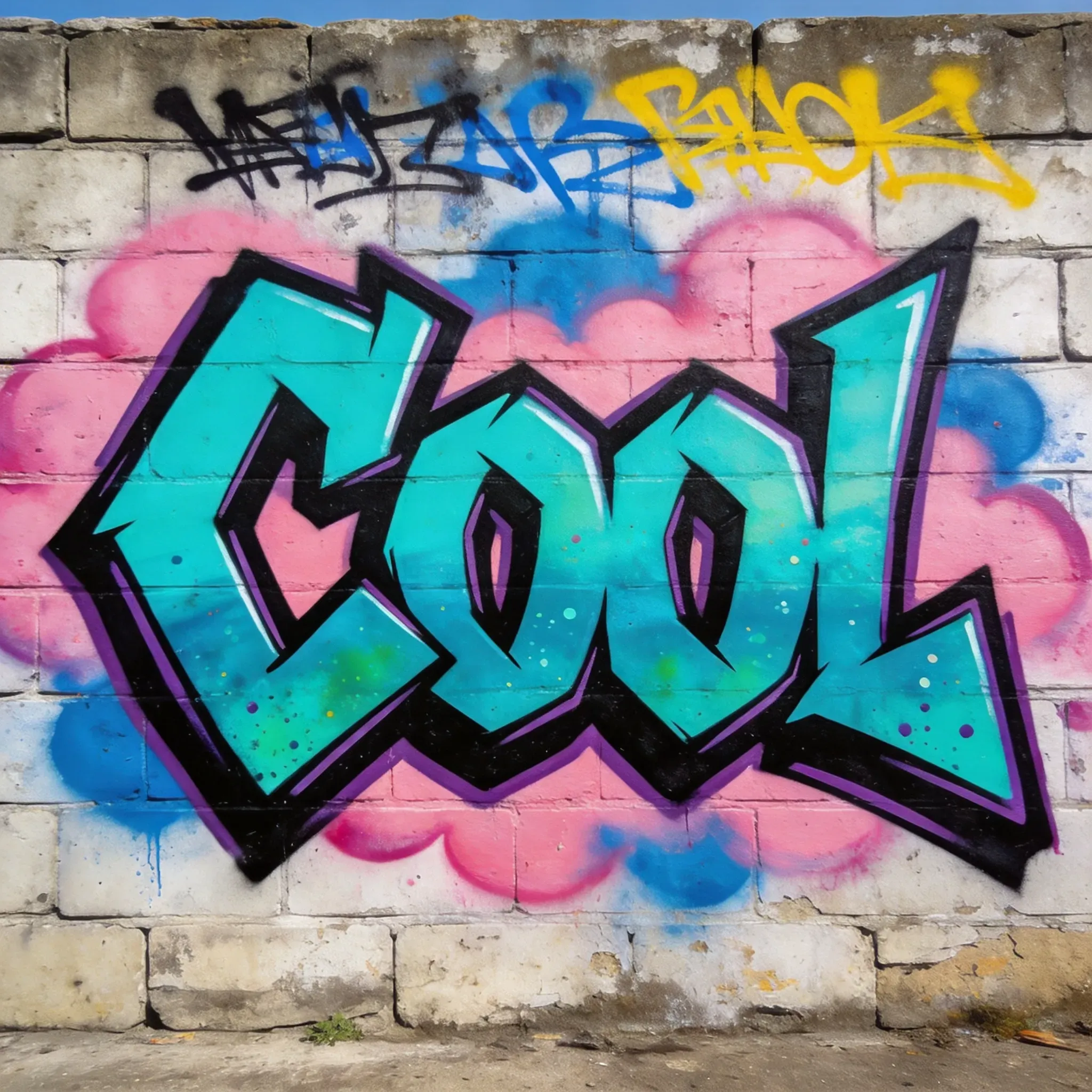
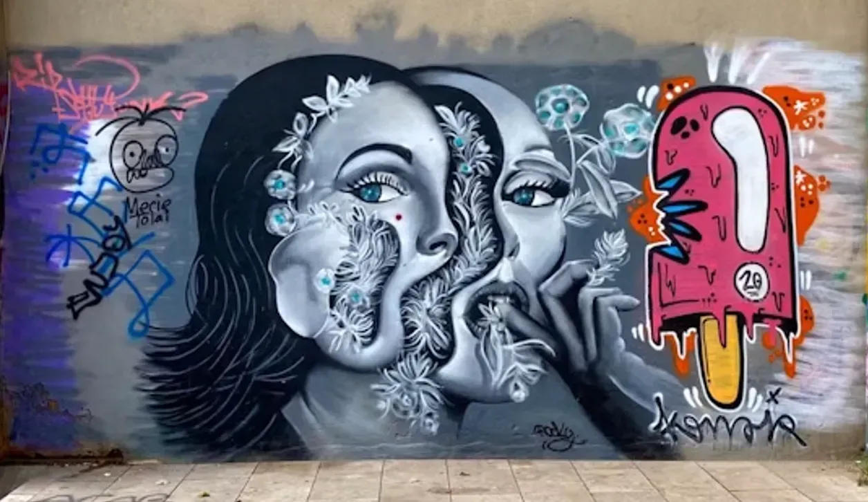
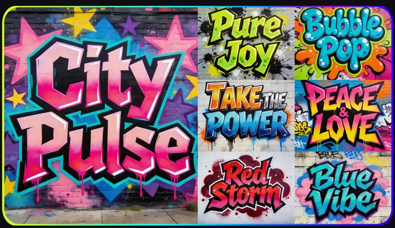
Bubble letters, block letters, Throw-Up graffiti, and template art are usually more readable. Wildstyle, abstract tags, and multi-layered mural styles are better for visual expression and attitude, but may make precise text hard to recognize.
Can AI Graffiti Preserve the Exactness of My Brand Name or Phrase?
Short names are more likely to succeed than long phrases, but complete text exactness cannot be guaranteed. If your brand name must be accurate, generate multiple options, select the clearest result, and check each letter before publishing or printing.
What Is the Best Surface for AI Graffiti Prompts?
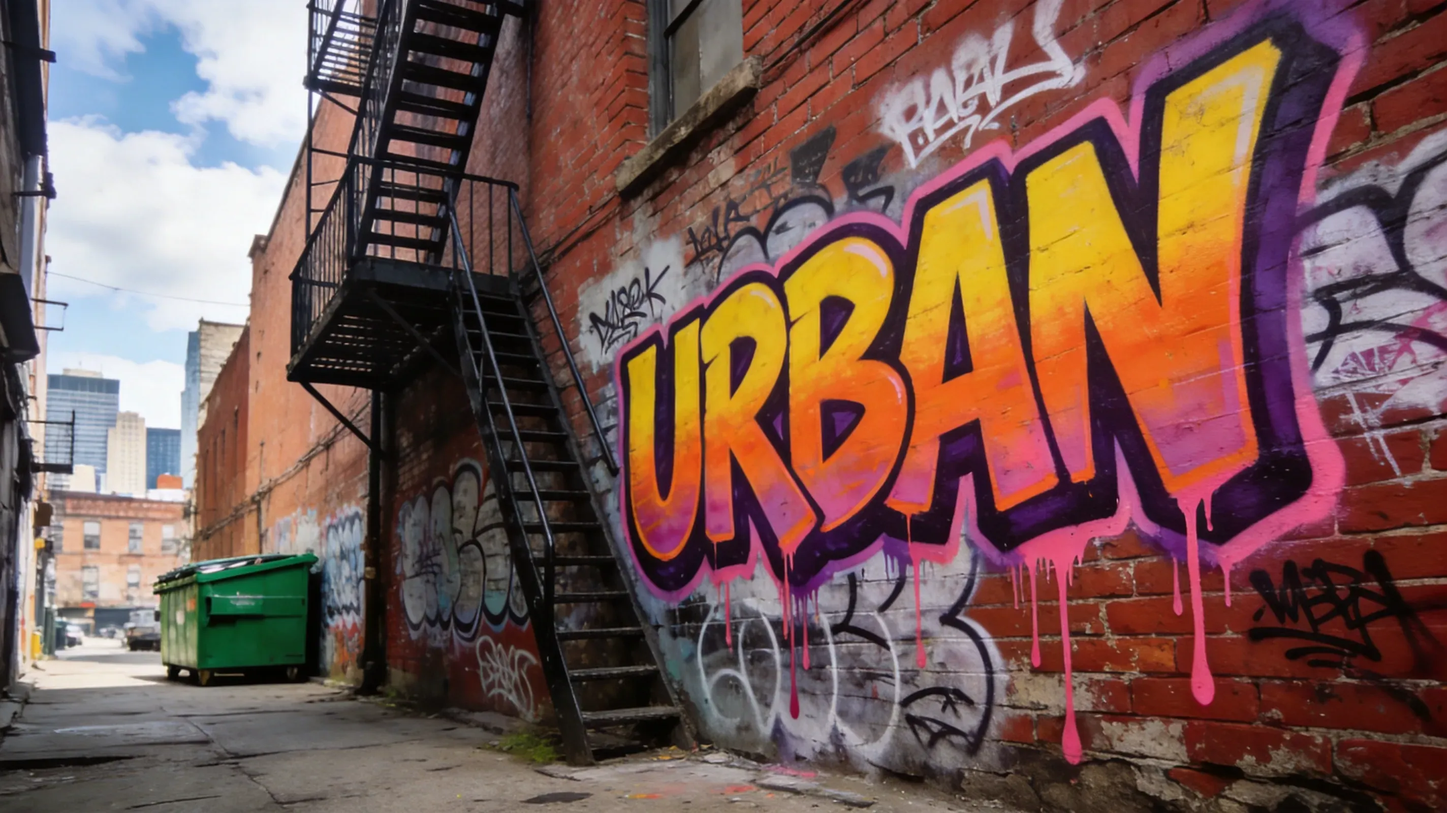
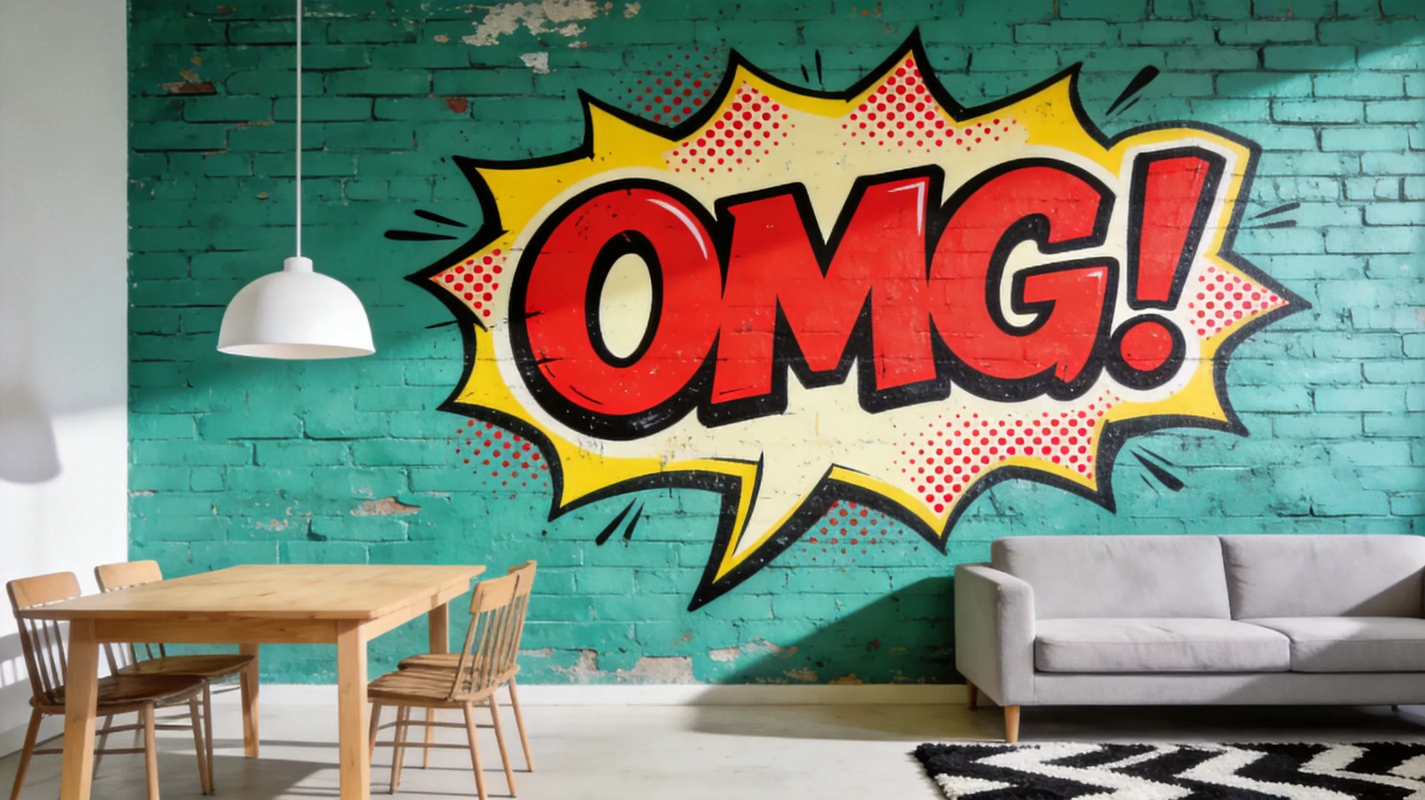
Brick walls, concrete walls, subway cars, storefront roll-up shutters, skate park ramps, alley walls, and poster backgrounds work well, as they align with common graffiti scenarios. Adding a surface to the prompt helps the AI integrate spray paint textures more naturally,
Is AI graffiti suitable for print-on-demand products?
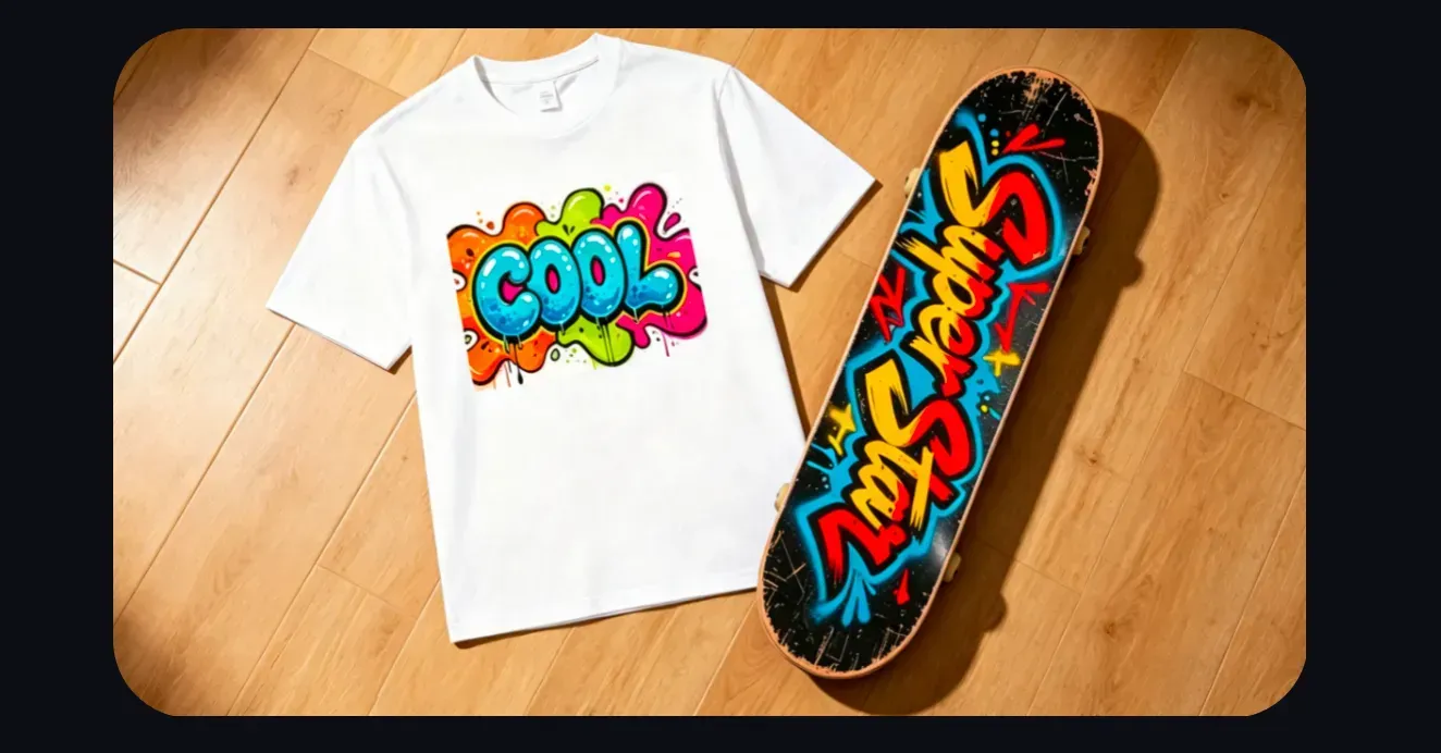
AI graffiti can be useful for exploring T-shirt, hoodie, sticker, skateboard, and poster concepts. Before production, check the output resolution, spelling, edge clarity, licensing terms, and whether the design needs vector cleanup for sharp printing.